design, blogging
Better code highlighting in Obsidian
Quick snippet to make obsidian code blocks readable without plugins
I'm a huge Obsidian fan, for everything from todo lists to long form journalling. (In fact what you're reading right now is written in it, exported as markdown then processed with a custom static site generator)
The default code blocks colors are atrocious, and the the accepted way to change that seems to be to install different themes and be cool with whatever highlighter comes with that. Pretty heavy handed if ask me, if you just need a minor change. Then there are plugins that are supposed to do it (Code Styler) but don't work or expect a specific theme to be installed to work.
Figured that we could probably overwrite some css, but couldn't find specs on this other than they use PrismJS and it's baked into Obsidian theme css.
Anyway, some digging through theme source code of the themes and excluding anything that's not relevant, we are left with this:
body {
    /* Code */
    --code-white-space: pre-wrap;
    --code-size: var(--font-smaller);
    --code-background: var(--background-primary-alt);
    --code-normal: var(--text-muted);
    --code-comment: var(--text-faint);
    --code-function: var(--color-orange);
    --code-important: var(--color-orange);
    --code-keyword: var(--color-red);
    --code-property: var(--color-blue);
    --code-punctuation: var(--text-muted);
    --code-string: var(--color-cyan);
    --code-tag: var(--color-red);
    --code-value: var(--color-purple);
}
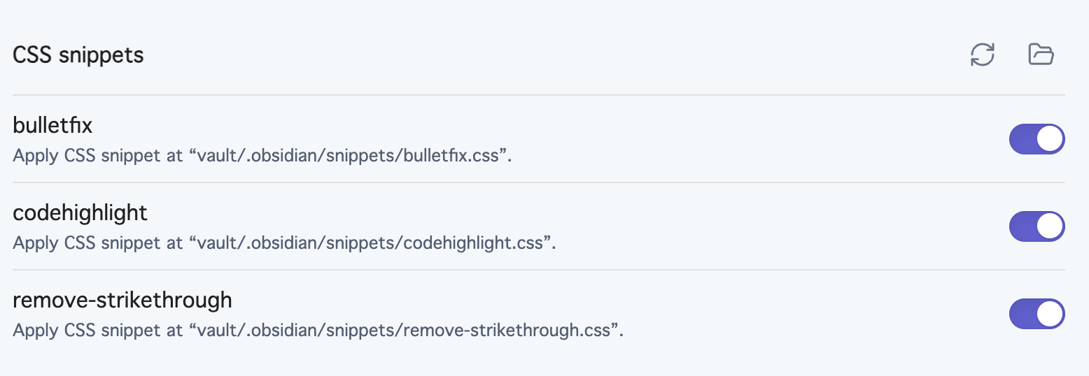
Go to appearance > CSS snippets in settings, open the snippets folder and stick it into a a css file, (name doesn't matter) and you're all set.

Maybe this will save you some time looking around, with fewer dependencies to worry about!